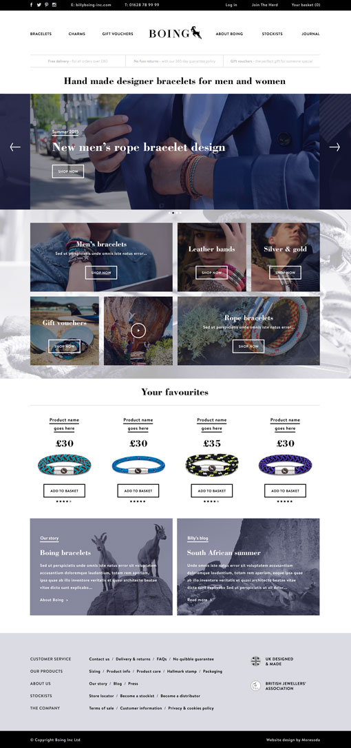
Boing create great jewellery, moresoda create great websites, here’s the result.
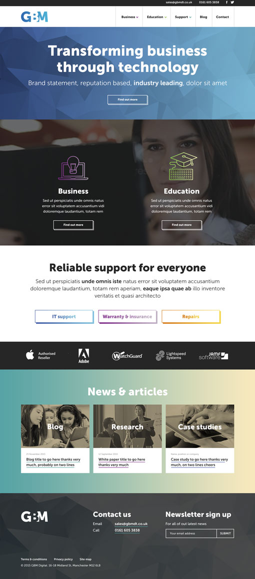
Working for moresoda we create visuals like this. A great job for GBM that went better than fantastic. The visual was approved and sent to build with minimal changes, making it a very satisfying project. It’s alive.
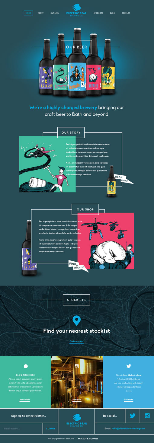
It just so happens that bear is only one vowel away from beer. So it makes sense that Electric Bear make delicious craft beer. Here’s a first stage web visual created whilst working for my West Country chums, moresoda. Admittedly it’s not as tasty as an Electric Bear beer (easy for me to say), nothing could be that tasty, but non the less, drink up.
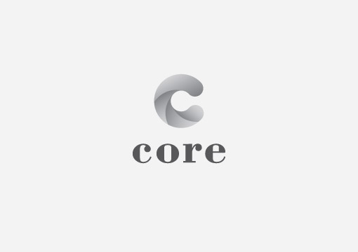
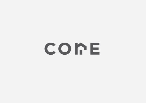
Another couple of logos that didn’t make the cut, again designed whilst at 3mil (I love these guys as much as chocolate milk), for Core property investment company. I even managed to move away from my go to logo font Din. Bodini got it’s long overdue turn at the dinner table.
The client requested a visual that somehow displayed drilling. I interpreted the request by trying to create a sense of drilling and movement within the large ‘C’.
Early on in the project I thought I had cracked the logo and felt pretty pleased with myself, unfortunately I had managed to create an exact replica of a logo already out there so it was a case of back to the drawing board. That will teach me for being so smug.
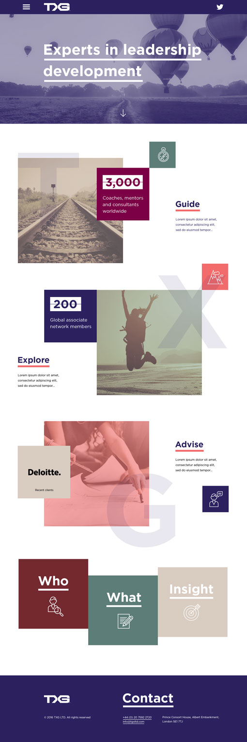
For some strange reason I can never remember the term parallax to describe the animation effect on scrolling. It constantly leaves me scratching my head, “yeah and these images will… erm… move on scroll, looking really nice” making me look not as nice and feeling like an idiot.
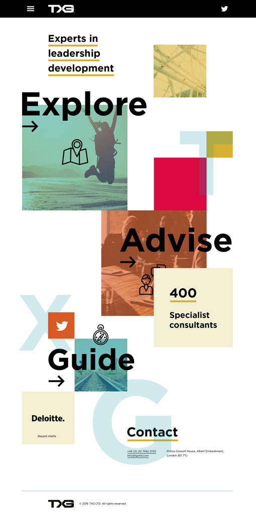
Of late, the term has become my nemesis whilst presenting visuals, the harder I try the more it eludes me. So, in an effort to exorcise my demons may I present you with two first stage web visuals for TGX, produced at 3mil, which would make use of parallax scrolling. There, I’ve said it, parallax, and in the right context and everything. Parallax, parallax, PARALLAX.
Who would design a logo like this?
Me.
Final logo. Well, nearly.

Pitches are great. As long as you win them that is.
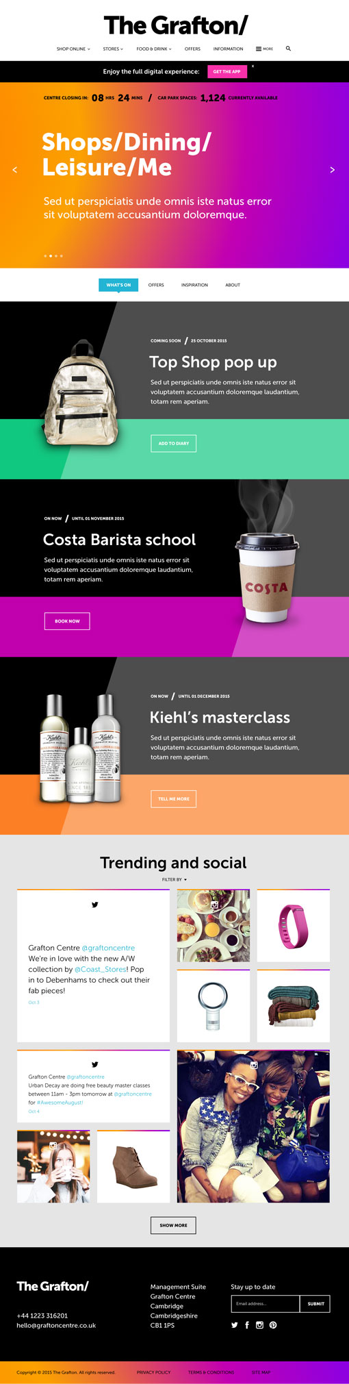
Groovy pitch web visual designed for the Grafton shopping centre whilst working at 3mil. It was nice to throw some colour at it for a change, as it seems that at the moment most of my visuals are white and minimal. Far out man.
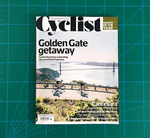
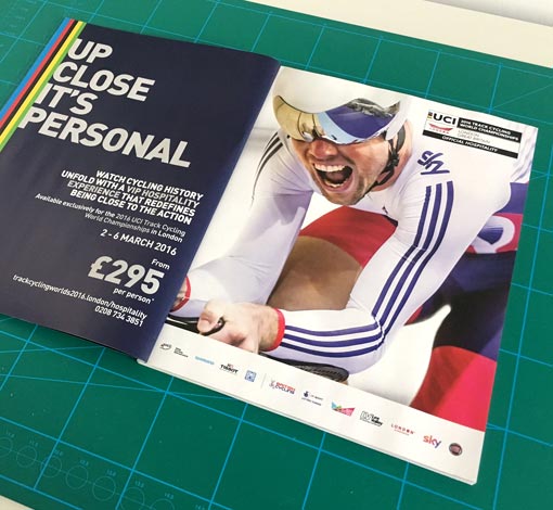
I like cycling, all the slightly odd obsessive nuances, specifications, rules and regulations appeal to me. The same can be said for print design. So with a spring in my step and silky smooth legs, I got to combine two of my favourite subjects in producing a double page spread for the UCI Track Cycling World Championships 2016, to feature in the best and it just so happens, my favourite cycling publication, ‘Cyclist’. Part of some ongoing work STH Group.