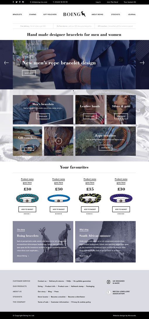
Ant and Dec emoji sticker that sadly didn’t get the go ahead for the final Geordiemoji app.
You can download the app without Ant and Dec here for Apple. Or here for Android.
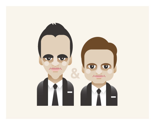
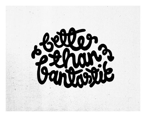
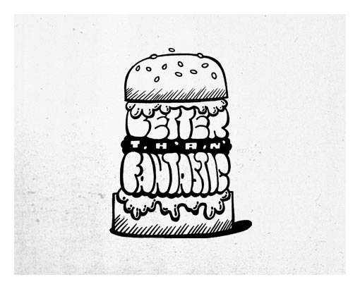
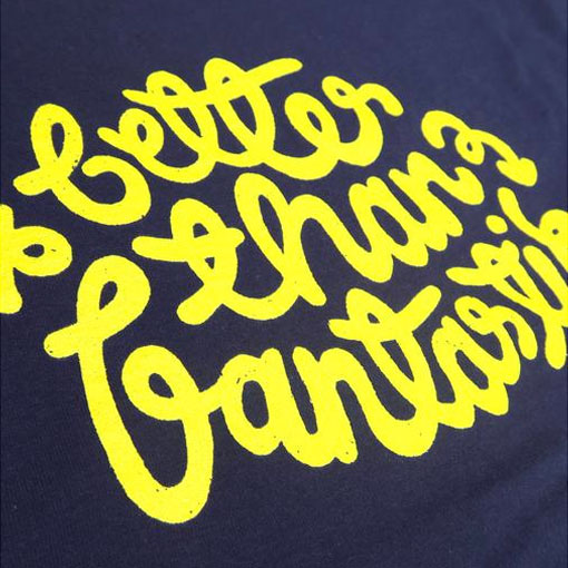
As mentioned in an earlier post I created some t-shirt designs for motivatetee, good tees for good causes. Here are the initial concepts and visuals. All hand drawn to give them personality and to celebrate the imperfection. Now enough words, more pictures…
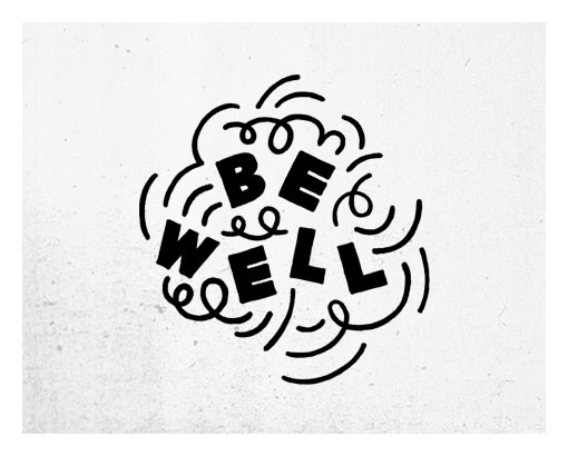
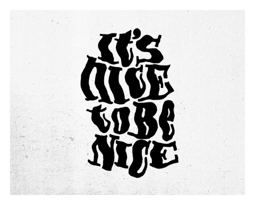
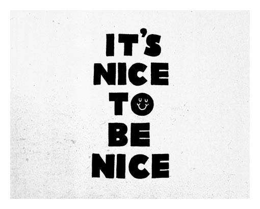
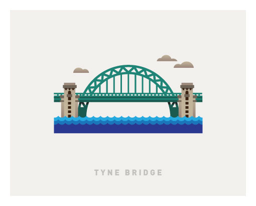
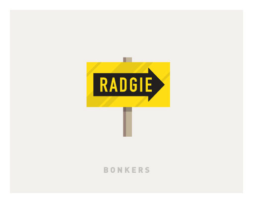
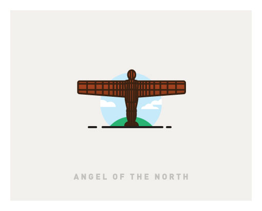
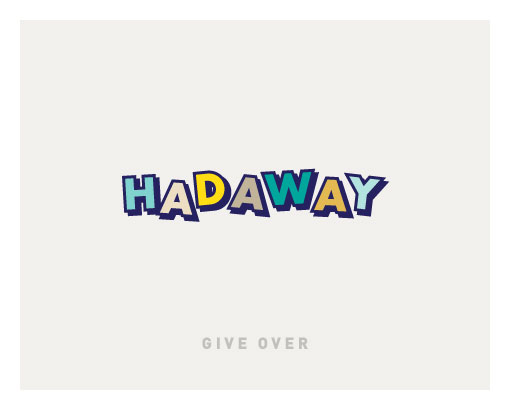
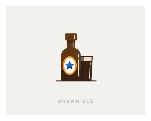
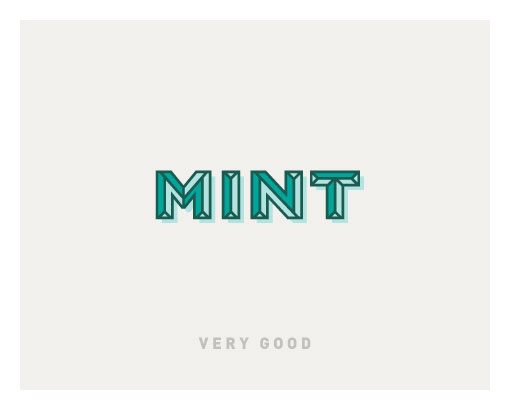
Recently I was approached by Fanmoji to create a suite of Geordie emoji stickers, Geordiemoji, for all your online northern chat. Why? Because I fulfilled both the job requirements of being from the North East, fact, and able to colour in, questionable. This was a first for me emoji-sticker wise and it was a blast but boy oh boy did some of the spellings give me the run around. They opened up a whole can of Lambton Worms.
At the start of this year I worked on a project where I got to do way more drawing than usual, I thoroughly enjoyed it and was wondering how I could do more. As luck would have it the moons aligned and this project dropped into my lap.
You can get the app here for Apple. Or here for Android. A small selection follows…
It’s always a pleasure to work on a rewarding project, for the good of it, it makes up for past indiscretions, well a couple of the teeny tiny ones anyway. Pocket sized sins.
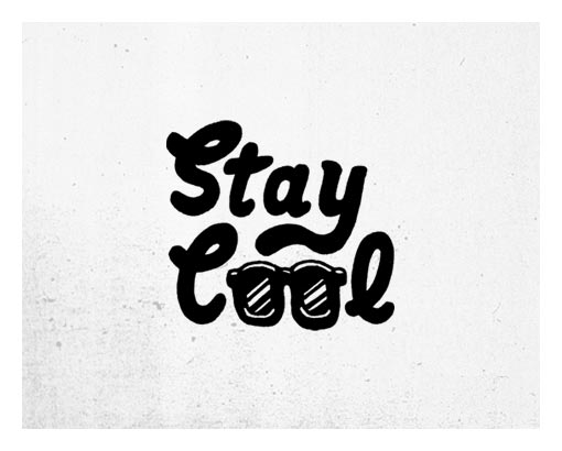
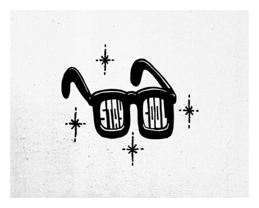
A couple of t-shirts I designed for motivatetee are now live on the world wide web. Grab yourself one, or maybe even two and wear happy in the knowledge that you’ve supported a great cause, Alzheimer’s Research.
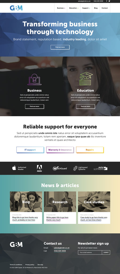
Working for moresoda we create visuals like this. A great job for GBM that went better than fantastic. The visual was approved and sent to build with minimal changes, making it a very satisfying project. It’s alive.
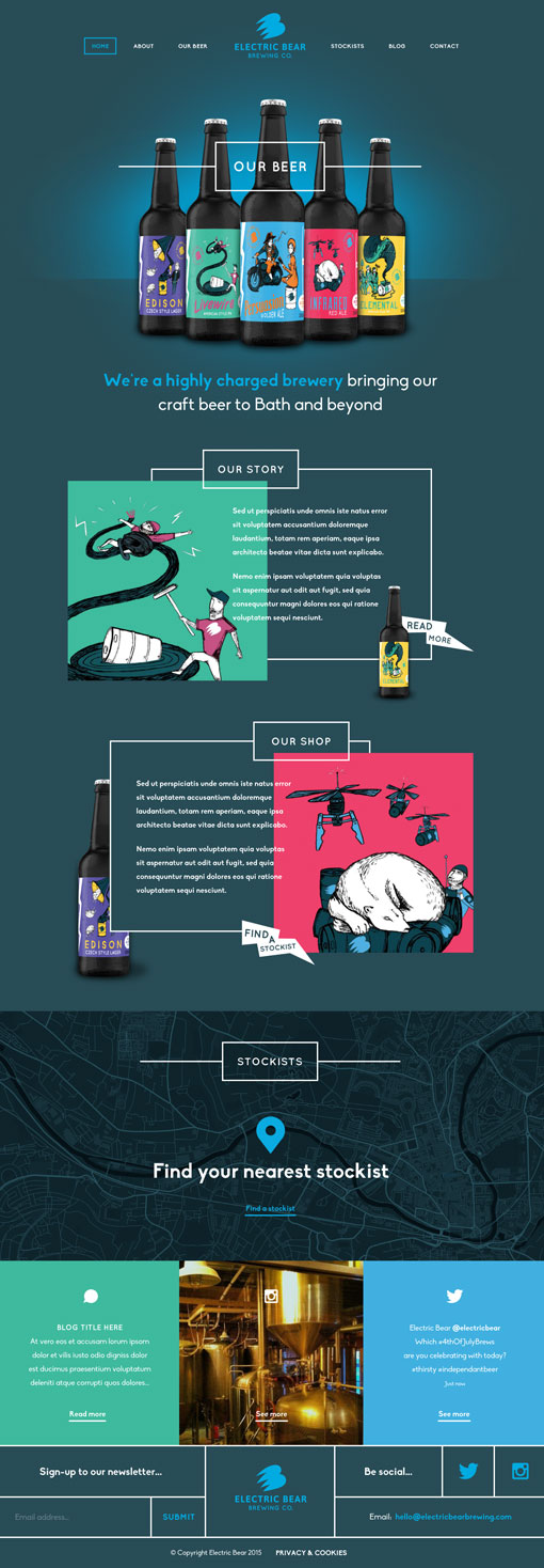
It just so happens that bear is only one vowel away from beer. So it makes sense that Electric Bear make delicious craft beer. Here’s a first stage web visual created whilst working for my West Country chums, moresoda. Admittedly it’s not as tasty as an Electric Bear beer (easy for me to say), nothing could be that tasty, but non the less, drink up.
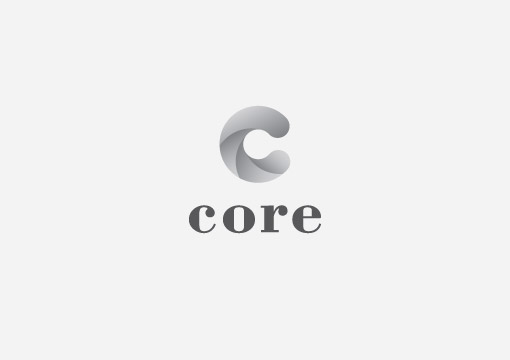
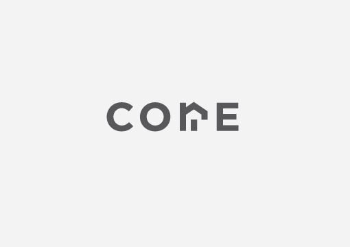
Another couple of logos that didn’t make the cut, again designed whilst at 3mil (I love these guys as much as chocolate milk), for Core property investment company. I even managed to move away from my go to logo font Din. Bodini got it’s long overdue turn at the dinner table.
The client requested a visual that somehow displayed drilling. I interpreted the request by trying to create a sense of drilling and movement within the large ‘C’.
Early on in the project I thought I had cracked the logo and felt pretty pleased with myself, unfortunately I had managed to create an exact replica of a logo already out there so it was a case of back to the drawing board. That will teach me for being so smug.
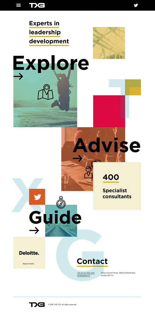
For some strange reason I can never remember the term parallax to describe the animation effect on scrolling. It constantly leaves me scratching my head, “yeah and these images will… erm… move on scroll, looking really nice” making me look not as nice and feeling like an idiot.
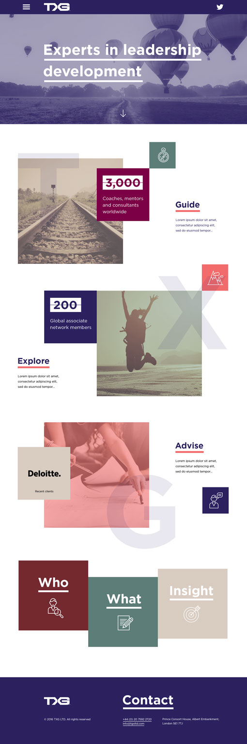
Of late, the term has become my nemesis whilst presenting visuals, the harder I try the more it eludes me. So, in an effort to exorcise my demons may I present you with two first stage web visuals for TGX, produced at 3mil, which would make use of parallax scrolling. There, I’ve said it, parallax, and in the right context and everything. Parallax, parallax, PARALLAX.
Who would design a logo like this?
Me.
Final logo. Well, nearly.