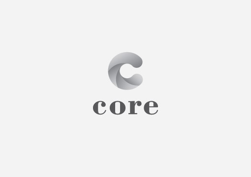
Another couple of logos that didn’t make the cut, again designed whilst at 3mil (I love these guys as much as chocolate milk), for Core property investment company. I even managed to move away from my go to logo font Din. Bodini got it’s long overdue turn at the dinner table.
The client requested a visual that somehow displayed drilling. I interpreted the request by trying to create a sense of drilling and movement within the large ‘C’.
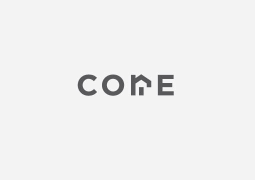
Early on in the project I thought I had cracked the logo and felt pretty pleased with myself, unfortunately I had managed to create an exact replica of a logo already out there so it was a case of back to the drawing board. That will teach me for being so smug.