Who would design a logo like this?
Me.
Final logo. Well, nearly.

Who would design a logo like this?
Me.
Final logo. Well, nearly.
Pitches are great. As long as you win them that is.
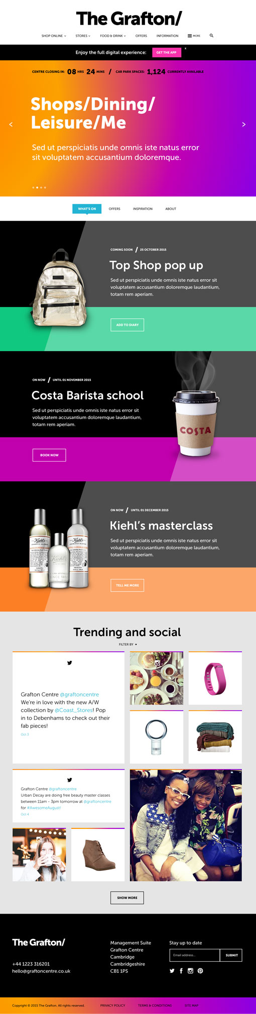
Groovy pitch web visual designed for the Grafton shopping centre whilst working at 3mil. It was nice to throw some colour at it for a change, as it seems that at the moment most of my visuals are white and minimal. Far out man.
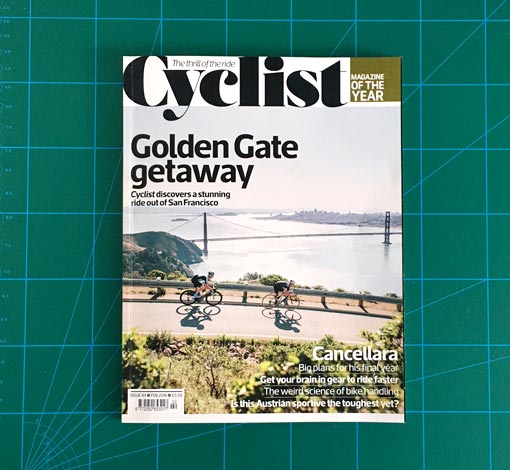
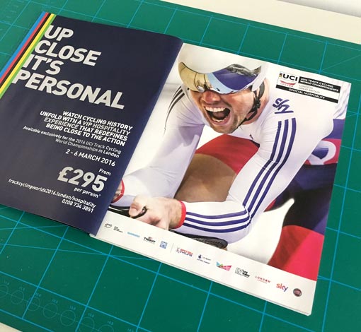
I like cycling, all the slightly odd obsessive nuances, specifications, rules and regulations appeal to me. The same can be said for print design. So with a spring in my step and silky smooth legs, I got to combine two of my favourite subjects in producing a double page spread for the UCI Track Cycling World Championships 2016, to feature in the best and it just so happens, my favourite cycling publication, ‘Cyclist’. Part of some ongoing work STH Group.
Yup, another music related logo. Tailored Rhymes. Signed sealed and delivered.
![]()
WIP… whatever that means. First stage logo visuals for a live music events company. Now, watch me wreck the MIC. Psych.
![]()
![]()
![]()
The only thing cooler than riding your fixed gear bike with tattoos on your bearded chops and your trouser legs rolled up down to your local antipodean coffee shop for an organic macchiato, must be designing a logo for an actual coffee shop, (I wore sunglasses indoors and my cap on backwards for inspiration). Coffee shop logo designed for the Wheatsheaf. Briefed to bring the logo up to date with a modern and contemporary feel. Here’s the final logo and two of the previous stages that got us there.
Can I have chocolate sprinkles on that please?


As a little person I couldn’t get enough Um Bongo, I would quaff the stuff like it was never going to go out of fashion. But it did. The jingle haunted my dreams.
Way down deep in the middle of the Congo, A hippo took an apricot, a guava and a mango. He stuck it with the others, and he danced a dainty tango. The rhino said, “I know, we’ll call it Um Bongo” Um Bongo, Um Bongo, They drink it in the Congo. The python picked the passion fruit, the marmoset the mandarin. The parrot painted packets, that the whole caboodle landed in. So when it comes to sun and fun and goodness in the jungle, They all prefer the sunny funny one they call Um Bongo!
Well… it’s back. Web visuals designed whilst working for the outstanding moresoda, Bath.
I never did get to go to the Congo.

Someone once said “Every morning in Africa, a gazelle wakes up, it knows it must outrun the fastest lion or it will be killed. Every morning in Africa, a lion wakes up, it knows it must run faster than the slowest gazelle, or it will starve. It doesn’t matter whether you’re a lion or a gazelle – when the sun comes up, you’d better be running.”
I once said here’s the sweaty new run club logo, slightly Nordic, as well as a couple of initial designs. It’s simple. Eat. Sleep. Run.
![]()
![]()
![]()
Back in 2011 I descended on The Big White in Canoobia to gain a qualification as a snowboard instructor. I documented my time there with a drawing of a thought from each day. In 2013 I returned to visit the homeland of my snowboarding education, tough men with beards and the elixir of life, maple syrup. Again I repeated this project.
Seeing as it is super sweltering in Blighty right now I thought this would be a particularly relevant and pertinent time to unleash some of these thoughts from my months stay in this triple frozen environment.


Whilst working at Baths finest, moresoda, I had the pleasure of designing a couple of homepage visuals for Angelberry, a frozen yogurt company from Bristol. The visuals were to also act as a brand start point so in this sense the job was an open book.
One smashing job, the client was an absolute dream, allowing a huge amount of creative freedom and Joe’s art direction was tip top, equating to one fulfilling and rewarding project. Angelberry went with the first visual of the two by the way.

